
The art of magazine design
'Content flows to where people want to read it. Some content is better online, some better in print.' The marriage of content and design is an art form, especially in a fresh magazine. The importance of a well-designed piece allows its readers to disseminate the information quickly and without thought. A magazine spread can be “digested” generally in one view because our peripheral vision encompasses the entire spread at normal viewing distance. On the other hand, a newspaper, especially large format broadsheet newspapers are scanned in several takes.
What makes for a good magazine spread?
Hierarchy - If it’s important make it important
Contrast - between colour, imagery, and typography
Grids - Know the grid and know when to break it
Columns - Makes the text easier to read
Typography - well contrasted and readable
Eye Lines - Keep a flow or movement about the spread
White space - we all need breathing space
Colour - when used well it can make it pop right off the page
Unity - Readers see a spread and its pages as one unit
Composition - Make use of the most visible area (outer and upper parts)
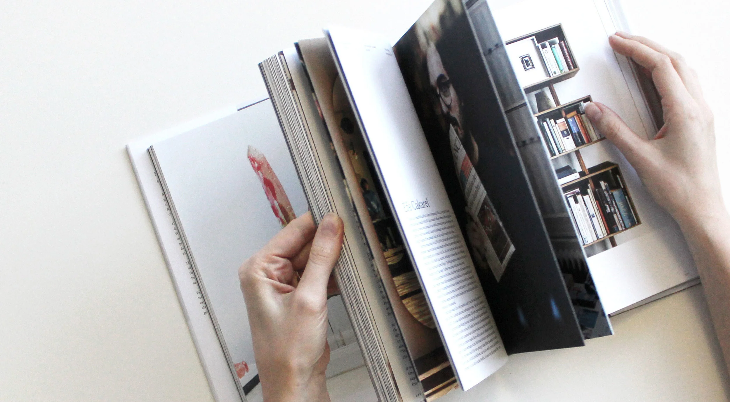
Not all areas of the spread are equal. Some have more importance, some have less. For example, when you go to the newsstand, you pick up a magazine, you grab the magazine by the spine with your left hand, and with your right hand, you flip through the pages.
The most visible area at that point is the outer part of the right page.
You should place your best content on the outside parts of the spread. These are the areas that are most seen. This is the place to put most provocative images and words. Put the best stuff where it will be most visible and where it will make the best impact. Most valuable areas of page spread are top left and top right parts, because when you skim through the magazine these are the areas where you look the most.
–
If you are thinking about creating or designing a Magazine and believe Handle Branding can help you, we would be more than happy to discuss with you how we can meet your needs to support your business growth and stability. Contact Handle Branding Sydney for further information.


